
About
Blockdot Academy is a Web3 education platform covering crypto trading, blockchain fundamentals, and jobs in the DeFi space. The brand needed to function as a serious institutional authority for newcomers and veterans alike.
Challenge
The brand spans three distinct areas — trading, employment, blockchain architecture — and needed to communicate all three without feeling scattered. The visual identity had to unify them under one cohesive structure that communicated authority, clarity, and trust.
Concept
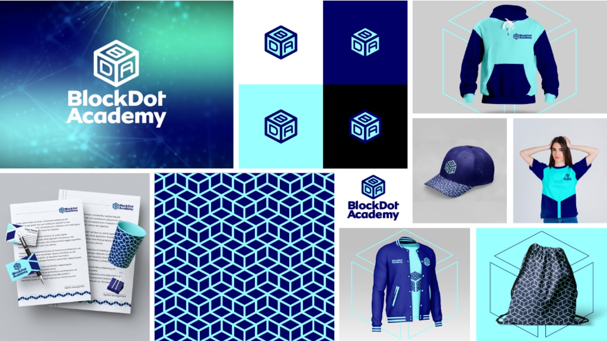
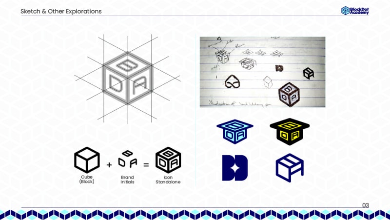
A cube. Direct translation of Block from the brand name, literal nod to blockchain. The cube is divided into three sections — B, D, and A on each visible face — structurally showing that Blockdot Academy governs multiple aspects of the Web3 space from one authoritative position.
Execution
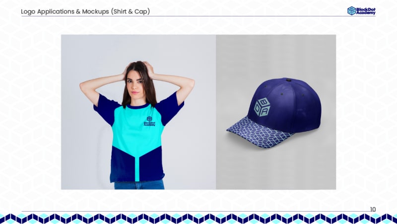
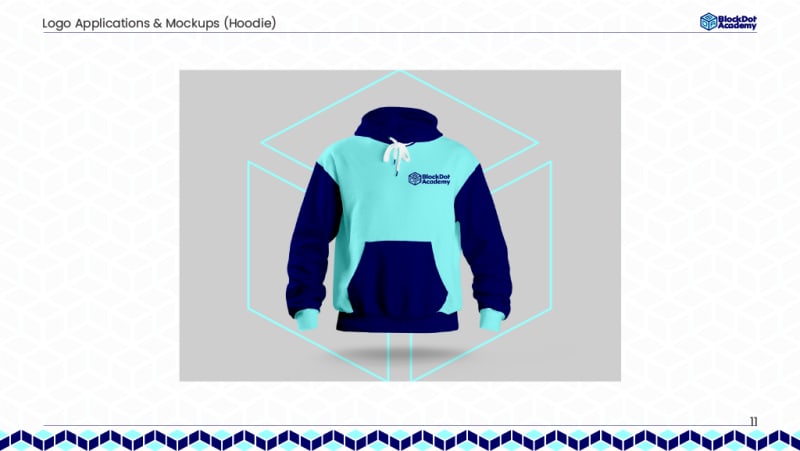
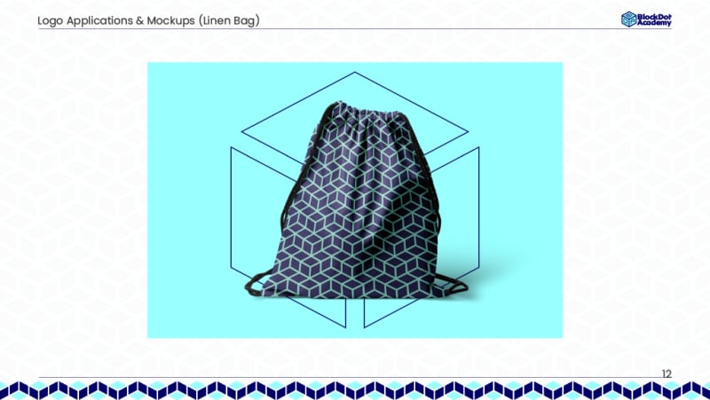
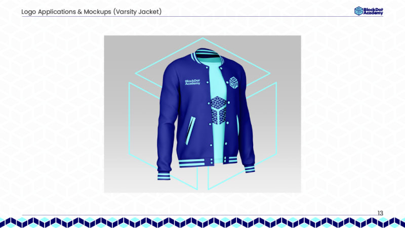
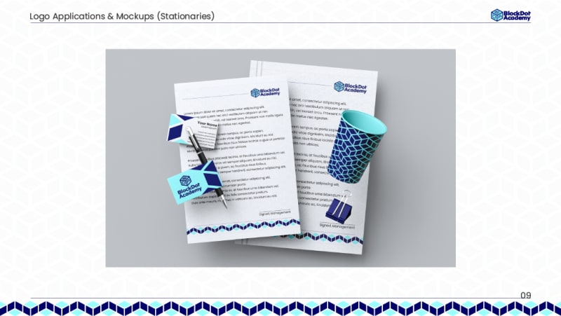
Logo constructed isometrically from a precise grid. Four lockups: horizontal, vertical, standalone icon, wordmark. Color: dark navy for trust and institutional weight, ice blue for clarity. MTN Brighter Sans — clean, geometric, modern. A repeating isometric cube pattern extends across merchandise: varsity jackets, hoodies, linen bags, caps, letterheads, cups.